Africa just got ‘bigger’ on the world map
Africa is finally taking up its rightful space on the world map after a UN General Assembly ruling voted in favour of the Equal Earth projection.
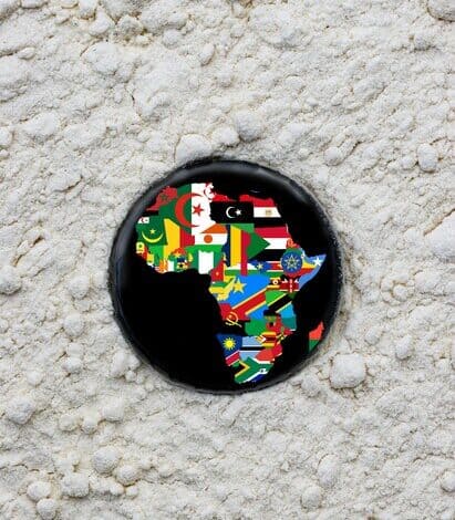
NO, the continent has not suddenly expanded!
Last week, the United Nations General Assembly voted overwhelmingly in favour of encouraging the world to use maps that more accurately show the size of Africa relative to other continents.
It wasn’t even a question as 164 countries voted in favour of the UN resolution – against the one dissenting vote from the United States of America, while Estonia, Georgia, Lithuania, Moldova, Serbia and Ukraine all abstained.
ALSO READ: Empangeni residents battle unreliable water supply
It’s important to note that the resolution is non-binding and does not ban the familiar Mercator projection.
Instead, it encourages governments, schools, international organisations and technology companies to consider equal-area projections, including the Equal Earth projection, when showing the relative size of landmasses.
So why does Africa look smaller?
It all comes down to the Mercator projection, which was created by Flemish cartographer Gerardus Mercator in 1569, designed primarily for navigation.
Its great advantage was that straight lines on the map could represent constant compass directions, making it useful for sailors plotting courses.
The problem is, the projection distorts the size of land the further it is from the equator. The result is that countries and continents on the northern and southern extremes of the globe appear much larger than they really are compared with areas around the equator.
Africa, which straddles the equator, is one of the biggest victims of this visual distortion.
Greenland is a particularly striking example. On a Mercator map, it can appear roughly comparable in size to Africa, despite Africa being about 14 times larger.
ALSO READ: Zululanders celebrate their heritage at festival
While the map was designed for navigation, centuries of use mean this particular visual representation has become deeply embedded in classrooms, textbooks, media, websites and our collective understanding of the world.
A campaign to ‘correct the map’
The campaign to change this was led by Africa, with Togo taking the lead in negotiations on behalf of the African group and the initiative, backed by the African Union.
The UN resolution argues that the distortion of continental size has contributed to the ‘symbolic minimisation’ of Africa, and calls for greater awareness of the limitations of different map projections.
Togo Foreign Minister Robert Dussey has been one of the key voices behind the initiative. “A fair map does not change the geography of the world, it changes how we see the world,” he said.
The resolution itself recognises that there is no perfect flat map of a spherical planet. Every projection involves some form of compromise, whether it is area, shape, distance or direction.
Africa by numbers
Just how big is Africa?
· 30.3 million km²: Approximate surface area of the continent
· About 20%: The share of the world’s total land area occupied by Africa
· 14 times: Approximately how much larger Africa is than Greenland
· 54 countries: The number of internationally recognised sovereign states generally counted as countries in Africa
· More than 1.5 billion people: Africa’s population, making it the world’s second-most populous continent
· Three time zones: Africa spans several time zones, from the Atlantic islands in the west to the Indian Ocean in the east, and stretches thousands of kilometres from north to south.
Perhaps the easiest way to understand the scale is this: Africa is so large that the United States, China, India, Japan and much of Europe can all be fitted inside it with room to spare.
*Source: United Nations General Assembly
What happens to the Mercator maps now?
You don’t need to start tearing down every wall map still using the Mercator projection. Mercator remains useful for certain purposes, particularly navigation, and the UN resolution does not prohibit its use.
What may change is the incorporation of a more Equal Earth projection across schoolrooms, businesses and online.
The most important outcome of the UN vote is not that Africa suddenly looks bigger, but that people start asking why it looked smaller in the first place – and what this means for the continent.
For schools, textbooks, digital platforms and anyone producing educational maps, the hope is that more accurate equal-area projections will increasingly become part of how the world is presented.
Don’t have the ZO app? Download it to your Android or Apple device here:


HAVE YOUR SAY
Like our Facebook page and follow us on Twitter.
For news straight to your phone invite us:
WhatsApp – 060 784 2695
Instagram – zululand_observer
TikTok – @zululand_observer