McLaren unveils new identity inspired by founder Bruce McLaren
A British supercar maker has refreshed its visual identity with a new wordmark and colour palette that draw on its New Zealand roots and racing.
McLaren has unveiled a new brand identity that brings together its racing heritage, automotive present and future ambitions, with a new wordmark inspired by the sign above the fuel station once owned by founder Bruce McLaren’s parents in Auckland, New Zealand.
The new identity draws directly on the vision of New Zealand-born Bruce McLaren and the early days of his career. It is inspired by the sign above the fuel station owned by his parents, Les and Ruth, in Remuera, Auckland, where McLaren built the car that would take him to his first racing victory at Muriwai Beach: a modified 1929 Austin 7.
“We’ve always looked ahead, driven by a restless desire to innovate, create and push beyond expectations. This evolution of our visual identity captures that spirit. It’s a reflection of the journey we are on as a company,” said David Woodhouse, chief creative officer at McLaren Automotive.
“It marks the beginning of a new chapter for McLaren, giving a physical expression to the ambition, creativity and forward momentum that is shaping our future.”
McLaren’s visual identity dates back to the founding of its racing outfit in 1963, when the logo featured a Kiwi alongside Bruce McLaren’s family name.
Lou McEwen, chief marketing officer at McLaren Racing, said the new identity connects the company’s history with its future.
“McLaren has evolved enormously over the years, but looking back through our shared history across Racing and Automotive, it’s poignant how much of Bruce’s original vision and spirit still runs through the business today,” she said.
“This evolved identity perfectly bridges that proud heritage with our future ambition. It celebrates the symbols and stories our fans, partners and team-mates already know and love, while giving us a more connected expression of where we’re heading next. It feels unmistakably McLaren.”
The new identity will appear across both McLaren Automotive and McLaren Racing. The Speedmark will be retained in Papaya Orange, while the wider colour palette draws on the marque’s history.
The palette includes Papaya Orange, Ember, a reference to the racing suits of the era, Midnight Blue, which has featured as an accent since the beginning, as well as Black and Anthracite.
Colnbrook and Mist complete the palette. Colnbrook represents the factory where Bruce McLaren built his first race cars, while Mist reflects the grey conditions of Muriwai Beach, where he claimed his first racing victory.
The rebranding forms part of McLaren’s long-term investment programme supporting the next phase of its development, including work on a new generation of supercars.
The company has also been looking back at its history, with models such as the M6GT faithfully restored as part of a series of stories that helped shape the McLaren brand.
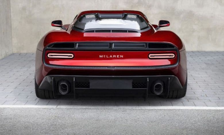
At the same time, prototypes such as the McLaren 6GT offer a glimpse of where the marque could be heading next.
Browse thousands of new and used vehicles here with CARmag!
The post New McLaren logo revealed honouring Bruce McLaren and New Zealand heritage appeared first on CAR Magazine.
Breaking news at your fingertips… Follow Caxton Network News on Facebook and join our WhatsApp channel.
Nuus wat saakmaak. Volg Caxton Netwerk-nuus op Facebook en sluit aan by ons WhatsApp-kanaal.