Home & Garden
How to master your home’s interior colour palette
Whether you want calm, warmth or drama, these colour tips will help you create a home that feels cohesive and connected.
From creating a sense of flow between rooms to setting a specific mood in each space, colour plays a powerful role in interior design, but getting it right isn’t always so easy.
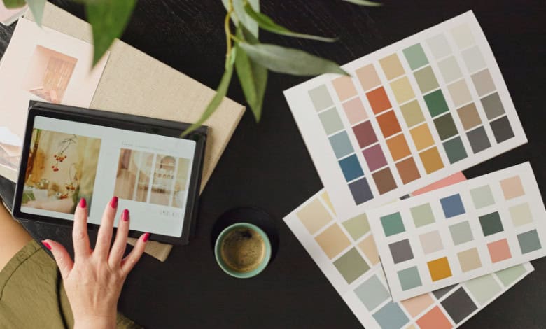
Start with these seven colour palette tips:
- Monochromatic sage: Layered greens with light oak furniture. This feels like a forest retreat and works best in bedrooms or home offices.
- The modern classic: Navy blue, crisp white, and gold accents. This is a timeless look that signals authority and luxury. It is perfect for formal dining rooms.
- Earthy hearth: Terracotta walls with sage green cushions and cream rugs. This palette feels grounded and welcoming. It’s ideal for kitchens and family living areas.
- Scandi sunset: Soft peach pastels paired with cool stone greys. This is a modern twist on the minimalist look. It adds warmth without sacrificing the clean aesthetic.
- Biophilic bold: Deep forest green with brass hardware and tan leather. This combination brings the outside in. It feels expensive and moody.
- The soft minimalist: Oat, sand, and charcoal for a high-end quiet luxury feel. This relies on the quality of the materials rather than the boldness of the hues.
- Playful pastel: Lavender and mint grounded by warm walnut wood. This is a great way to use colour in a light-filled sunroom or guest bedroom.
Once you’ve decided on the colour palette, it’s important to get the balance of the three main colours right. The 60-30-10 Rule will help you do just that. It stops you from overusing bold colours and ensures your room feels cohesive rather than messy.
- 60% Primary Colour: Your main background “canvas.” Use this for walls, large rugs, or sofas to set the background mood.
- 30% Secondary Colour: The supporting act. Use this for curtains or accent chairs to add interest and contrast without overwhelming the space.
- 10% Accent Colour: The room’s jewellery. Use this for cushions, art, or decor to add a saturated “pop” that draws the eye
Content by The Interior Design Institute.
For more on home and gardening, visit Get It Magazine.
At Caxton, we employ humans to generate daily fresh news, not AI intervention. Happy reading!