
Durban’s Super Giants unveils new look
At the centre of the new look is a redesigned Durban’s Super Giants (DSG) logo and a striking red, blue and gold colour palette.
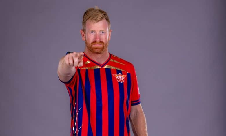
AHEAD of the launch of the SA20, Durban’s Super Giants unveiled its new look identity, marking the beginning of a new era for the Durban franchise.
At the centre of the new look is a redesigned DSG logo and a striking red, blue and gold colour palette.
Together, they represent a franchise that is ambitious about its future and proud of the city it calls home. The new identity builds on that ambition. Red represents the energy and passion of the team and its supporters.
Also read: Durban North resident helps U19 Italian cricket team triumph
Blue brings strength and confidence, while gold represents ambition and the pursuit of excellence.
The new look will be introduced across DSG’s playing and training kits, Kingsmead stadium, digital platforms, merchandise and fan experiences ahead of the new SA20 season. The evolution also brings Durban’s Super Giants closer to Lucknow Super Giants in the IPL and Manchester Super Giants in The Hundred, creating a stronger and more recognisable Super Giants identity across three of the world’s leading cricket markets.
Dr Sanjiv Goenka, chairperson of the RP-Sanjiv Goenka Group, explained the new look.
“Durban is a city with extraordinary energy, warmth and sporting passion. We want Durban’s Super Giants to reflect that spirit and to build something the city can truly be proud of. This new identity represents our ambition for DSG. We want to compete at the highest level, create memorable experiences for our supporters and build a franchise that becomes an enduring part of Durban.”
For more from Northglen News, follow us on Facebook ,X or Instagram. You can also check out our videos on our YouTube channel or follow us on TikTok.
Click to subscribe to our newsletter – here