5 South African brands accused of copying their logo
If you're going to copy, copy right, as some of South Africa's biggest brands have discovered.

The Citizen reported on Friday that many on social media called out Absa for the similarity of their newly launched logo to that of Telkom’s fibre company, OpenServe.
This led to a newsroom argument, as some said the two indeed looked too similar, and others said the connection was tenuous at best. The logos are below, and you can decide for yourself.
1. Absa vs OpenServe
Whether or not you think Absa’s logo is a cheeky copy or just mildly similar to OpenServe’s, this certainly seems to be what many social media users have been saying.
To help shift attention away from the bank and help the new logo’s designer feel a bit better, it can be pointed out that this is not the first case of a South African company, or rapper, for that matter, being called out for alleged plagiarism at worst, or possibly drawing a bit too much inspiration at best.
2. Cassper Nyovest vs Cartoon Network
A person is also a brand these days, marketing experts say, especially if he’s arguably South Africa’s biggest rapper. Mr Fill It Up himself (or perhaps his graphic designer) is the perpetrator of one of the more blatant examples of ‘drawing inspiration’ on this list.
The man clearly likes cartoons. His nickname, Mufasa, comes from a Lion King character, his actual name is similar to Casper the Friendly Ghost and, most importantly for this piece, his logo has been called out for being nearly identical to Cartoon Network’s.
In 2017, a website called South Africa Latest News claimed the massive cartoon company was planning to sue the rapper, although the authenticity of the story has not been verified.
3. MultiChoice vs NBC
You would think that if MultiChoice, who are involved in television, was going to get inspiration for their logo, they would look further afield than another player in the television space – massive American broadcaster NBC.
However, a quick glance at the two logos makes it hard to come to any conclusion other than that the SA company drew inspiration from the US one. In our local entertainment provider’s defence, though, the NBC logo depicts a peacock, while the MultiChoice one is just a bunch of colourful geometric shapes.
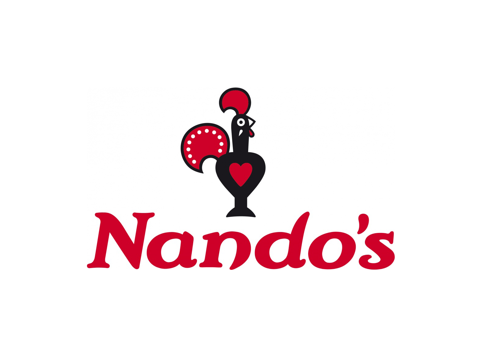
4. Fernando’s vs Nando’s
While this list looks mainly at SA companies doing the copying, sometimes they are the victims.
Whatever UK chicken joint Fernando’s puts into their peri-peri sauce, it certainly isn’t originality. Rather than simply copying a logo, Fernando’s seems to have copied their better-known counterpart Nando’s entire business plan, with not only a similar font and picture of a stylised chicken in Portuguese traditional dress, but a similar menu too.
If you had to defend Fernando’s, which is admittedly hard, you could point out that, at the very least, their chicken was facing the opposite way to Nando’s. Whether this will stand up in court remains to be seen – Werksmans Attorneys is suing Fernando’s on Nando’s behalf.
5. Cell C vs the copyright symbol
When Cell C rebranded back in 2010, some pointed out the similarity of their logo to the copyright symbol. Whether Cell C encountered any problems due to this when copyrighting their logo – which as a giant cellular network, they must have done – is a matter of speculation. The Cell C logo has also been seen by some as being a bit similar to The Citizen’s. As the saying goes, if you’re going to steal, steal from the best.
In the post-postmodern world of today, there’s nothing new under the sun. Picasso once said: “Good artists copy, great artists steal.” I’m not entirely sure what that means, but I do know that almost everything anyone ever produces has been inspired by what came before it. Perhaps if you are going to draw inspiration, the trick is to try do it subtly enough that you don’t get caught.
For more news your way, download The Citizen’s app for iOS and Android.
For more news your way
Download our app and read this and other great stories on the move. Available for Android and iOS.


